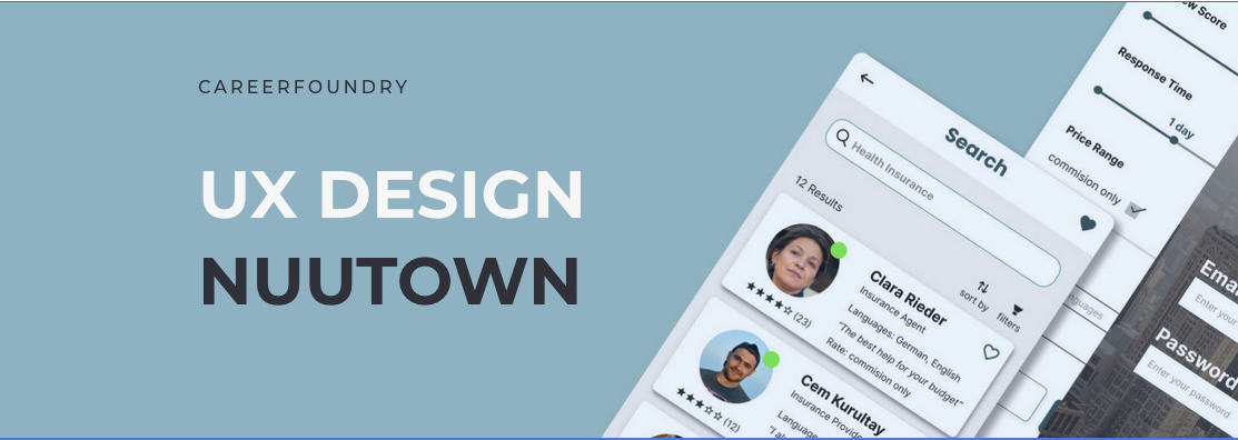
Nuutown
A service directory and booking platform for expats to find everything they need in their new town (and an opportunity for bad puns).
Overview
Nuutown was developed during a UX design bootcamp as a concept taken from initial idea to clickable high-fidelity prototype. It's a responsive web app: a directory and marketplace where expats can search for and book video sessions with service providers in their new country. Real estate agents, lawyers, doctors, handyworkers. The people you need but can't find when you don't speak the language and don't know where to look.
As a premium feature, users can hire an assistant who handles the research and legwork for them. The brief was simple: design a solution that lets users book sessions with experts via video. Starting from that prompt, I developed the full concept, from research and personas through wireframes to a tested, interactive prototype in Figma.
Responsibilities
- Competitor analysis
- User research & interviews
- Personas and user flows
- Wireframing & prototyping
- Usability testing
- UI design
Tools
- Pen & paper
- Miro
- Balsamiq
- Adobe XD
- Figma
- UsabilityHub, Optimal Sort
The Design Process
I followed a full UX design process from initial conception to high-fidelity prototype: Discover, Define, Ideate, Test, and Iterate. Each phase built on the last, and the goal was to stay close to real user needs and avoid designing in a vacuum.
The Challenge
I've lived abroad myself, so the problem was personal. "Expat in [insert country]" Facebook groups are littered with requests for real estate agents, movers, gardeners, doctors, hairstylists. Finding these people in a foreign country is a genuine pain point. The solution also had clear monetization pathways if it were ever launched commercially.
Discover
Competitive Analysis
I started by analysing existing directory solutions to understand what was already out there and where the gaps were.
User Interviews
I ran 4 user interviews with expats aged 31–45 via Skype and Zoom, ranging from 20 to 50 minutes. Three lived in Berlin, one in Porto. All had been in their new country for several years.

Affinity Mapping
After the interviews, I used affinity mapping to identify recurring themes and pain points.
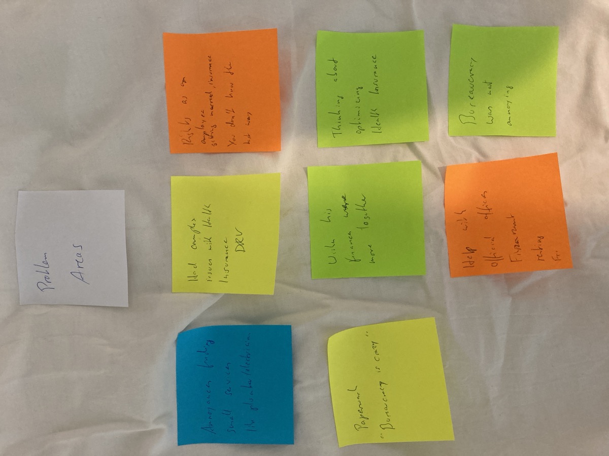
What I learned
- Not speaking the native language creates real barriers
- Bureaucracy is frustrating (worth mentioning twice)
- Some people prefer diving in independently, others want help from day one
- Getting everything organized initially overwhelms people
- Even independent types seek help for serious matters: health, legal, financial
- Most interviewees managed adequately but felt they missed opportunities
- Everybody hates chatbots
- Users trust service providers most when recommended by friends
Define
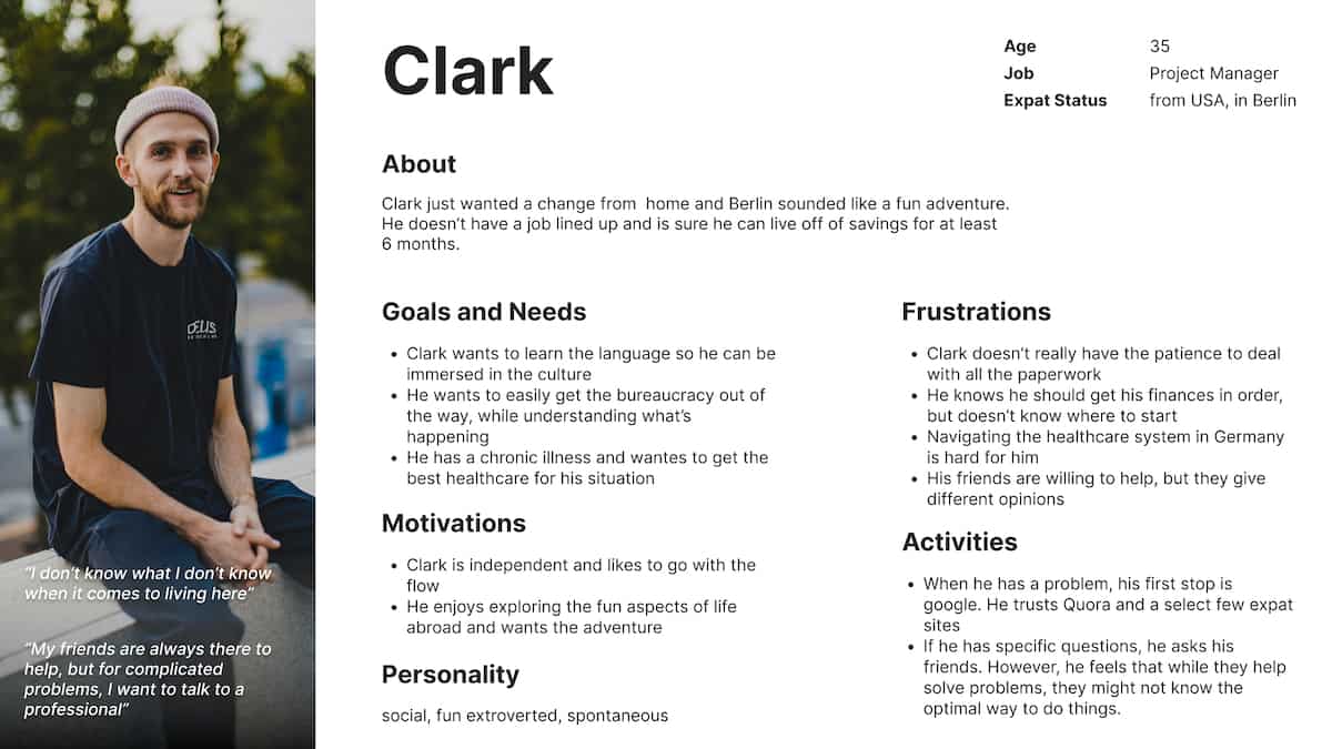
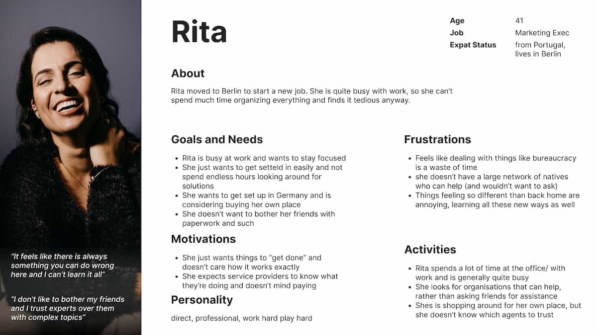
Personas
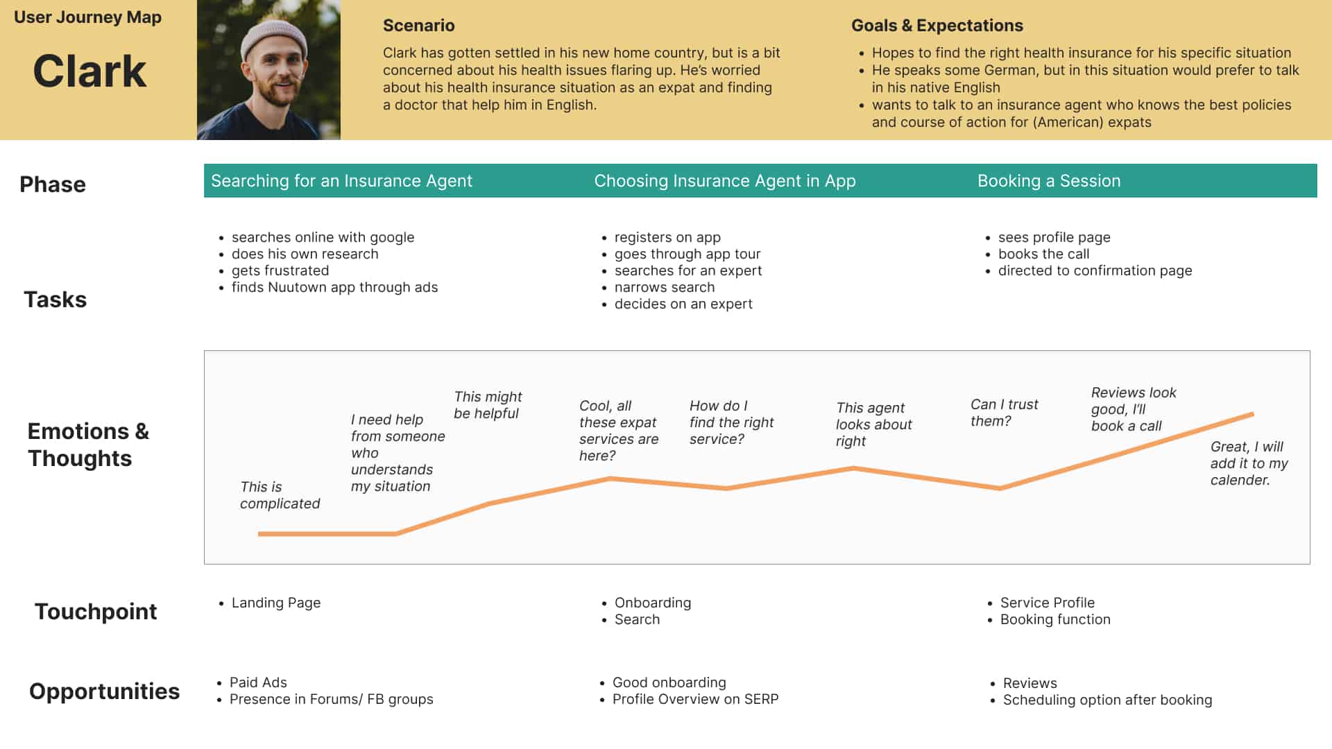
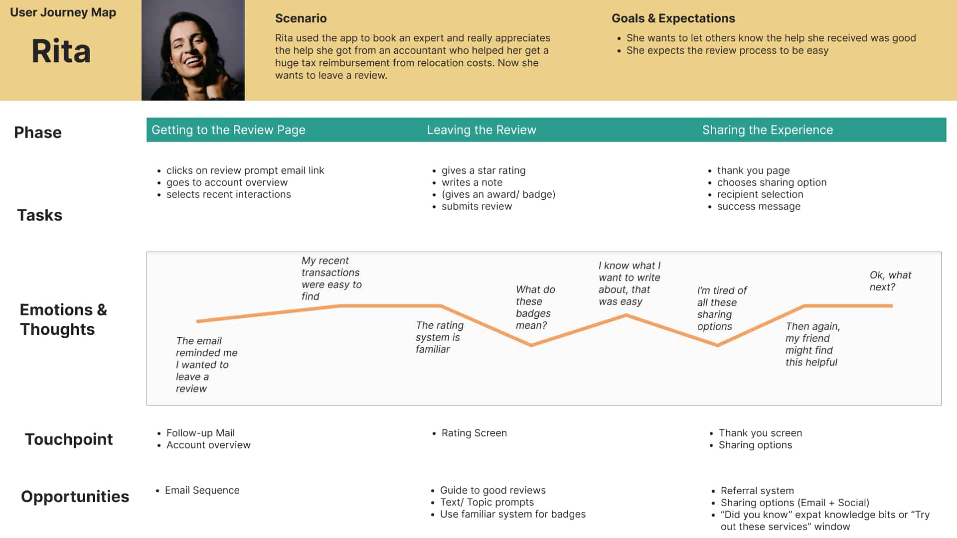
Two personas came out of the research, each representing issues multiple interviewees mentioned. They gave me distinct perspectives for developing scenarios and identifying trouble spots that needed elegant solutions.
User Journeys
I created user journeys for both personas to empathize with potential users and understand their mental models. This mapping revealed the trouble spots that would need the most design attention.
Ideate
"We must design for the way people behave, not for how we would wish them to behave." — Donald A. Norman
The Solution
The solution had two parts: a directory-style app where users search and browse service providers for contact, and a premium assistant service for people who'd rather have someone else handle the research entirely.
The assistant idea came directly from the interviews. People's biggest constraint was time and energy, not information. If someone could just handle it for them, they'd happily pay for it. This created clear revenue opportunities.
From Sketches to Screens
- Created scenarios and mapped them as user flows
- Card sorting tests to understand how users think about app structure
- Those findings shaped the sitemap
- Lo-fi mockups in Balsamiq and Adobe XD
- Peer feedback to catch design problems early
- Refined and moved to hi-fi prototyping in Figma
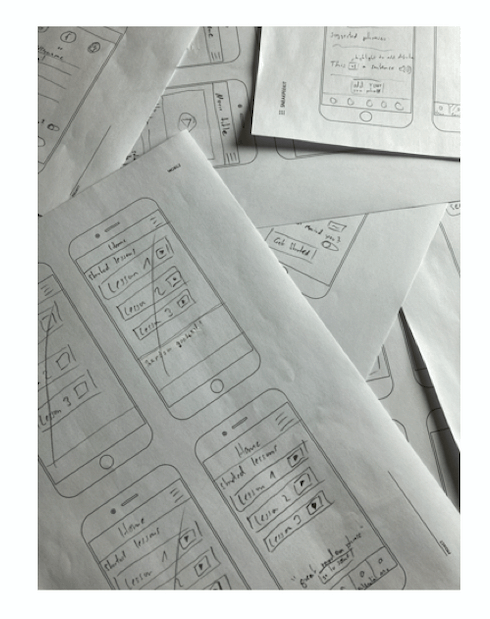
I tried to balance effort before testing: enough fidelity for realistic feedback, not so much that I'd be too invested in a wrong direction.
Wireframe to High-Fidelity

Test
6 remote, moderated usability tests. Three scenario tasks each. The study recruited 6 participants through personal network and social media, with testing on June 16th and 17th, 2021. Participants had diverse backgrounds regarding gender, age, and birth country.
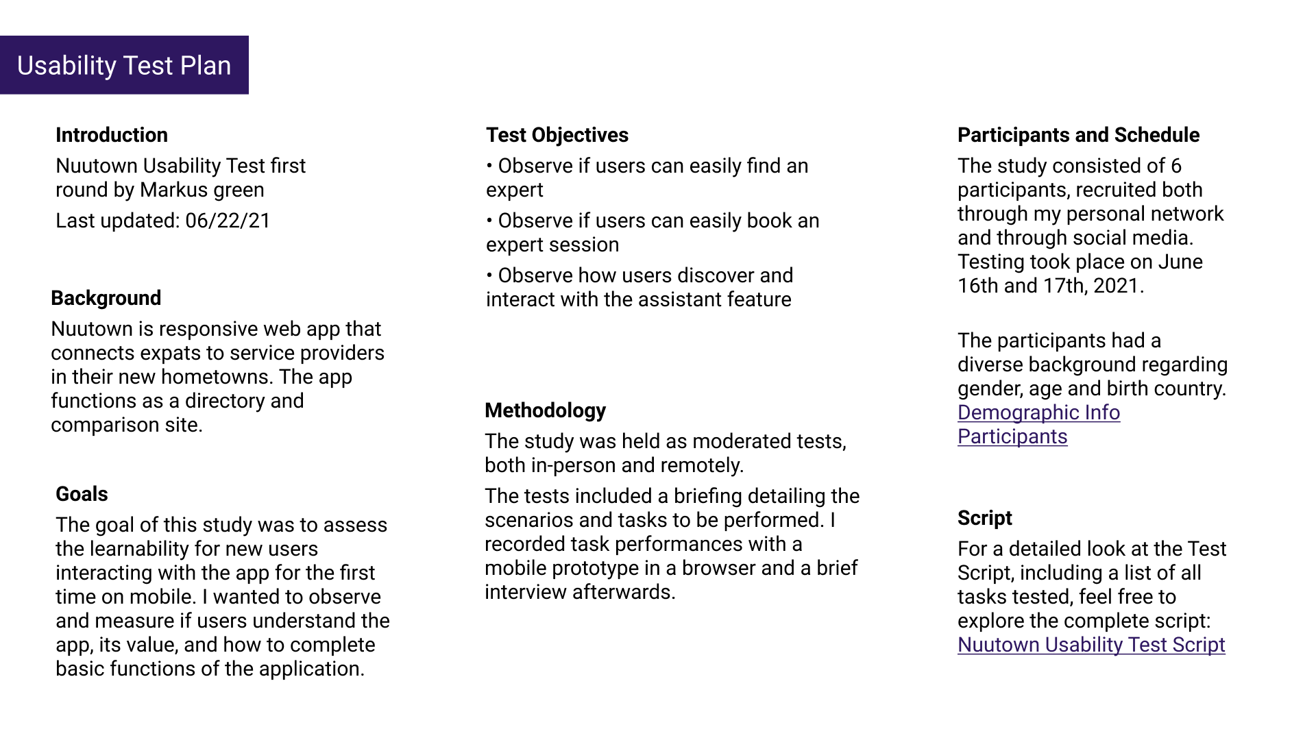
Test Objectives
- Can users easily find an expert?
- Can users easily book an expert session?
- How do users discover and interact with the assistant feature?
Overall reception was positive, and the assistant feature particularly impressed people. All participants completed the test, though 2 had difficulty with one scenario.
Key findings
- The assistant feature was popular once people understood it, but it caused initial confusion without onboarding
- Added an onboarding screen after the first 2 tests (and it helped immediately)
- Modified the test script after discovering 2 users struggled with one task (the task was the problem, not the design)
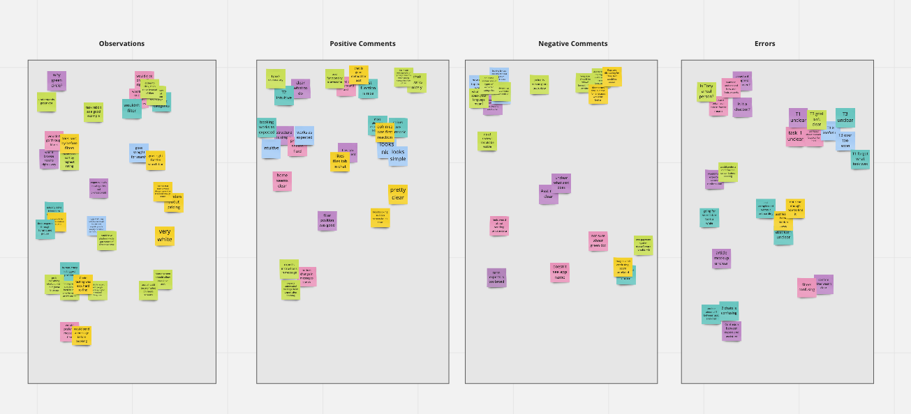
Organizing Findings
I organized findings into observations, positive comments, negative comments, and errors. Built a rainbow spreadsheet to see patterns at a glance: which issues came up repeatedly, and where I could make the biggest impact with changes.
Iterate
The main lesson: trying to make everything available at once confused people. A streamlined approach worked better. The test findings made it clear what to fix.
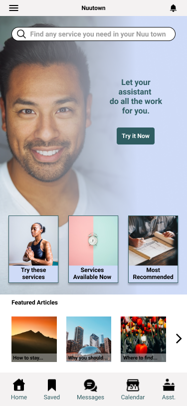
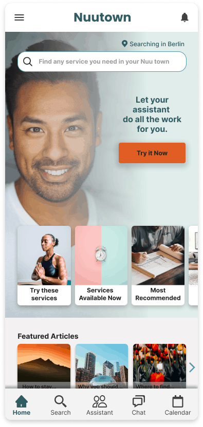
Home Screen Evolution
This went through multiple iterations, preference tests, and conversations with industry experts. The guidance kept coming back to the same thing: simplify, and direct people toward the features that actually help them.
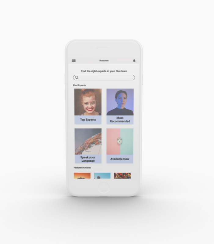
One interviewee put it perfectly: "I don't know what I don't know." That led to category suggestions on the home screen. The primary CTA leads to the assistant, because that's the feature users loved and would happily pay for.
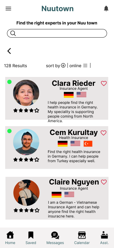
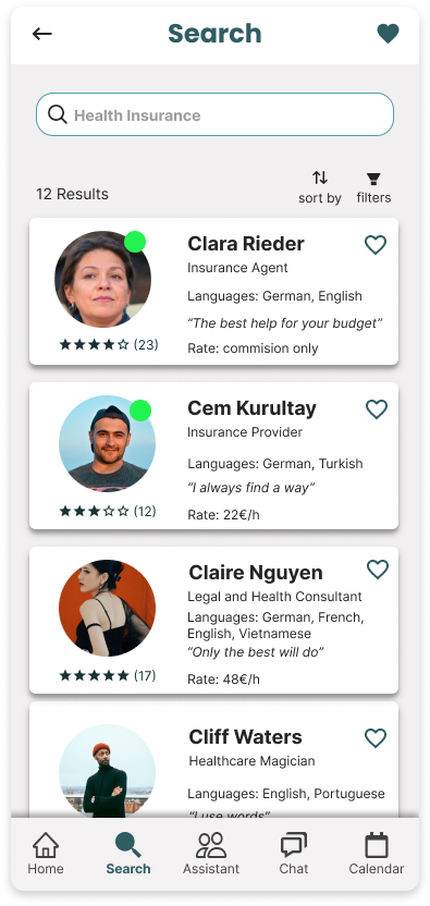
Search Results
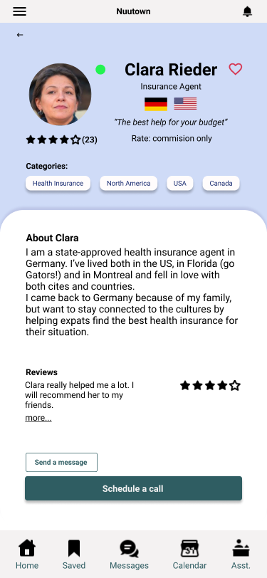
The initial version was oversaturated with color. I simplified the cards and focused on what users actually asked for: rate, an introductory tagline, and languages spoken (spelled out, since flag icons were confusing). Replaced floating green dots with an "online now" badge, borrowing a pattern people already recognize from other apps.
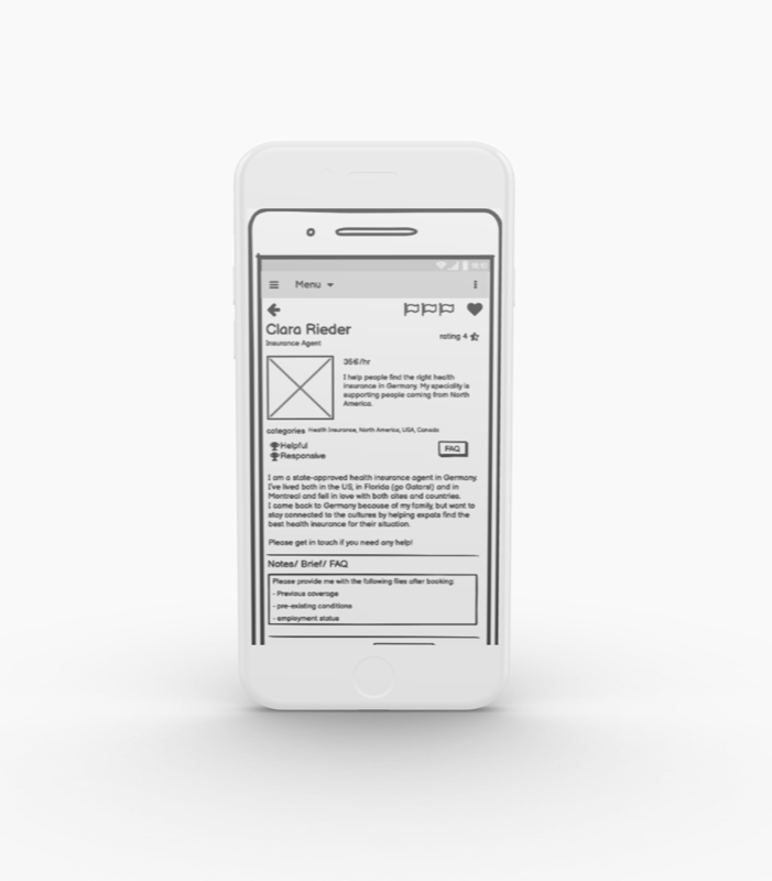
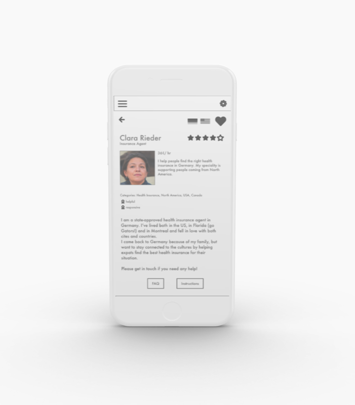
Expert Profile
The expert profile needed to give users enough information to decide whether to book: rate, tagline, categories, languages, reviews, and a clear call-to-action.
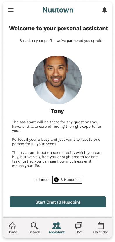
Assistant Feature
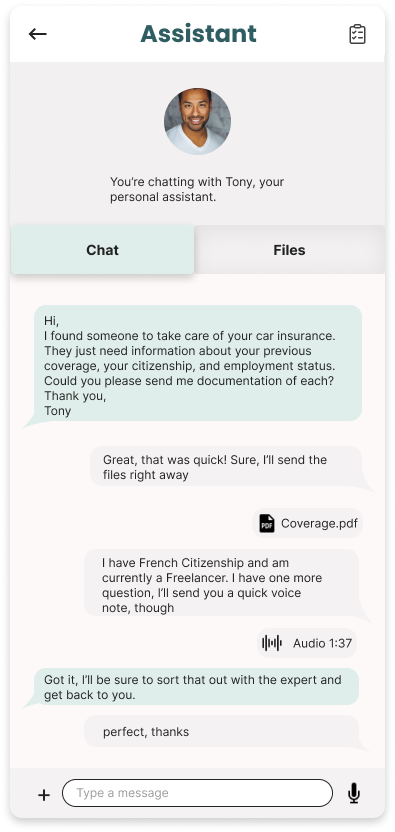
The most popular feature in testing, once people found it. So I gave it prominent placement on the home screen for conversion. A simple onboarding screen explains what it does. The interaction happens via chat. Familiar, simple, practical. It also doubles as a file repository for documents, accessible via the tab bar.
The in-app currency payment system wasn't popular during testing. Something worth exploring differently in the future.
Next Steps
Meet the Assistant
The assistant is a standout feature. If it's cleverly solved from both the user side and the backend, it would make for a strong business case. If we can get more people to try the assistant, I'm confident we'd see a high rate of returning customers.
This would need to be verified by tracking the number of assistant tasks booked. It would be worth testing the features and doing more research on expected functionality, but also getting clear on the optimal price point, and whether a subscription model or in-app purchase model makes more sense.
To explore this, I'd conduct a series of interviews again, focusing especially on users who are happy to pay for convenience.
UI and Scope
The UI could use more polish, and I think it would be important to work out how the suggestion categories function. For a first launch, it would make sense to focus on one category (housing, finances, etc.) for a more targeted marketing approach. This would allow for a realistic product scope and promises to users that are easier to uphold. More research could identify the biggest pain points for expats moving abroad and inform which category to start with.
Privacy and Community
An important topic to address is privacy and security. Users would be sending private documents with sensitive data, so we'd need to put users at ease and handle data responsibly.
Another aspect that came up frequently during discovery was community. A good networking and recommendation system could add a lot of value.
Takeaways
I'd built various products before, but I rarely used direct interviews to learn about the problem. I'd go off user sentiment from message boards, Quora, reviews, but nothing has given me better insight into users' worries than actually talking to them.
It's not about users providing a solution (that's where I see the designer's role). It's about them sharing what they actually do with or need from a product. There are strange things going on in the world. Some people use scissors to cut their pizza. As quoted above: "We must design for the way people behave, not for how we would wish them to behave."
I found that I really enjoy designing the "how it works" rather than "how it looks." Creating high-level functionality from user research, rather than fleshing out visual details. I don't disregard aesthetics (something that looks nice is generally more likeable), but I'd make a great partner for someone detail-oriented and visually gifted who doesn't quite see the big picture.