Careerfoundry
UX Design
Nuutown
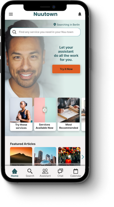
Nuutown is a responsive web app that functions as a directory/ marketplace and enables expats to book video sessions with service providers they need in their hometowns.
It’s an easy solution for people overwhelmed with finding real estate agents, lawyers, doctors, handyworkers or anything else that may come up.
As a premium feature, users can book an assistant that takes care of tasks for them.
Overview
In this course, I went through the whole UX design process, from initial conception to a hi-fi prototype by working on a project, outlined by Careerfoundry.
The project brief demanded I find a solution for an app that allows users to book sessions with experts via video.
Responsibilites
Competitor Analysis
User Research
User Interviews
Personas and User Flows
Wireframing
Prototyping
User Testing
UI Design
Tools used
Pen & Paper
Miro
Balsamiq
Adobe XD
Figma
Usability Hub
Optimal Sort
The Challenge
As I am usually cooking something up, side-project wise, so I had a number of ideas to go with for the project. Since I like living abroad myself, I have dealt with the difficulties of finding the services you need. More importantly, any “Expat in insert country” Facebook group is littered with requests for real estate agents, movers, gardeners, doctors, hairstylists and the likes. Finding these people in a foreign country seems to be a real problem.
I also easily could come up with ways to monetize this solution if I decided to really launch it, so I settled on working on this project.
The Design process
- Competetive Analysis
- User Interviews
- Affinity Mapping
- Personas
- Journey Maps
- User Flows
- Lo-Fi Wireframes
- Hi-Fi Prototype
- Usability Testing
- Peer Feedback
- UX Refinements
- Visual Design
Discover
Learning more about My users
User Interviews
The first step I took was looking around what solutions already exist. As I couldn’t find a real product, I decided to look at other directory sites to see what approaches I can transfer to my own idea and why they don’t work in users’ scenario.
More importantly, I wanted to get a better understanding of how other people solved their issues with getting settled in a new town, so I conducted a series of interviews with expats, now living in Berlin and Portugal.

I conducted 4 user interviews with people aged 31-45 via Skype/ Zoom, ranging between 20 and 50 minutes. 3 interviewees live in Berlin, one in Porto, Portugal and all have been in their new home country for a few years.
Key Insights
After talking to some people about their life in their new hometown, there were some recurring themes and issues that I wanted to keep in mind when designing a product.
- Not speaking the native language of your new home is a problem
- Bureaucracy is annoying
- Some people like to dive right in, others preferred some help from the start
- Getting everything in order in the beginning can easily get overwhelming
- Even the people who liked to solve their own problems asked for help when things got serious, e.g. health, legal or financial matters.
- Most interviewees found it easy to get by, but realized they were missing out on all the country has to offer (What do you mean the government pays for UX-design courses?)
- Everybody hates chatbots
- Bureaucracy is so annoying it deserves a second spot on this list
- Users trust service providers the most that were recommended by friends
Define
User Personas
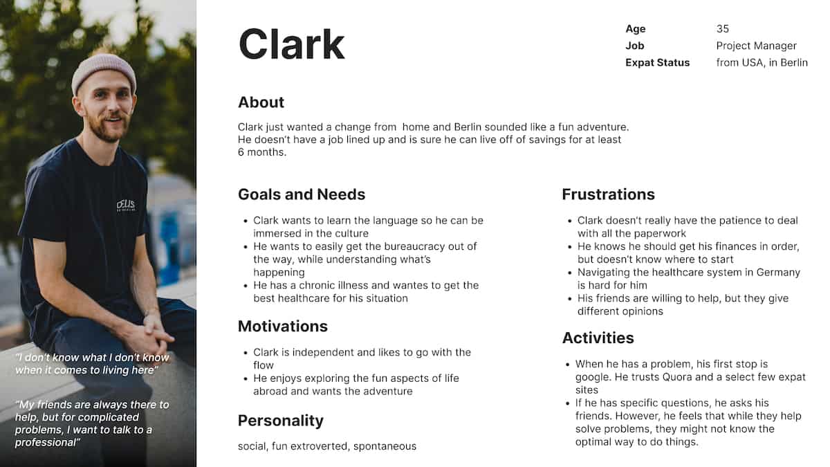
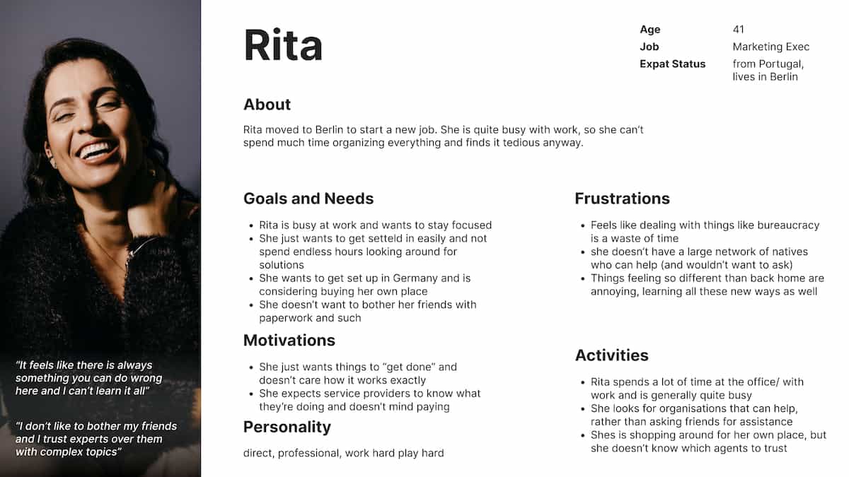
To get a better feel for who we’re designing for and to make things are bit more personal, I developed these two personas.
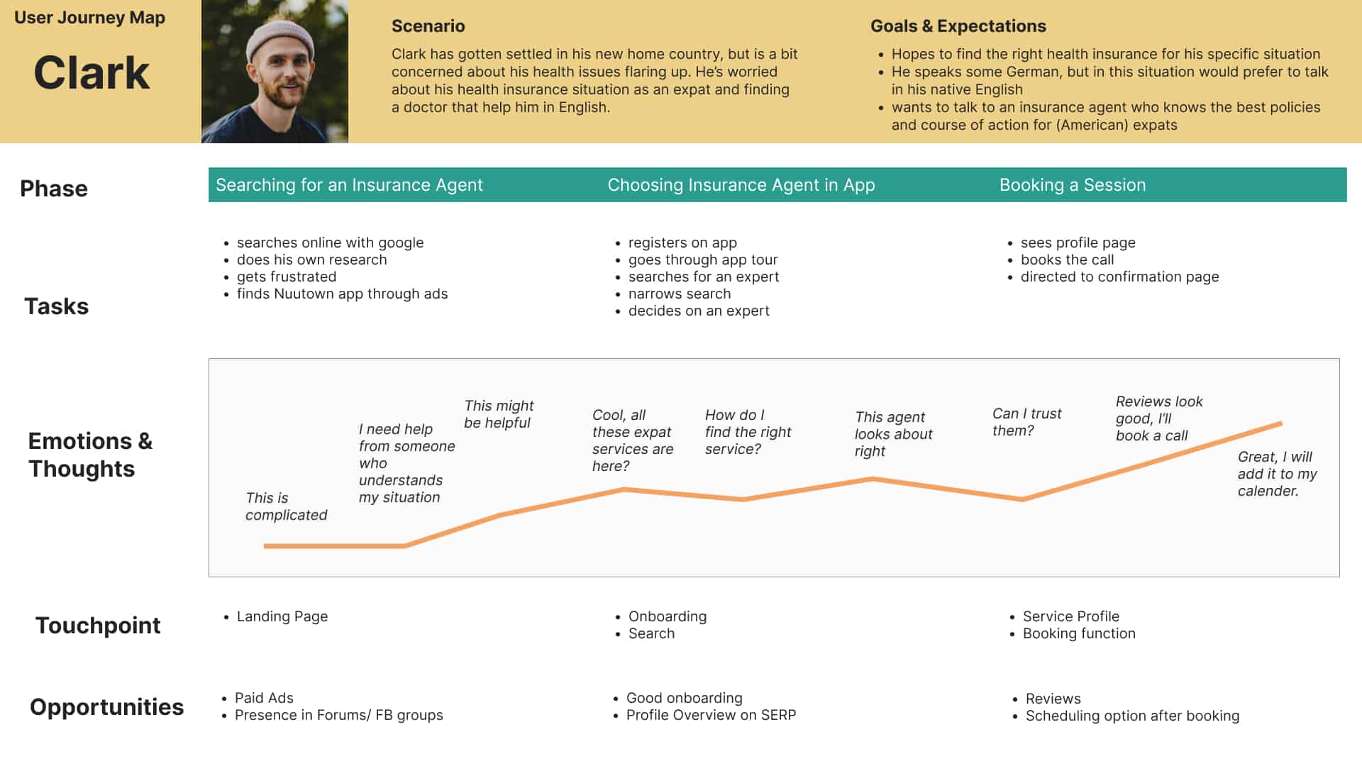
Clark, a pretty chill, sociable dude who enjoys life and wants to have a bit of fun while he’s living abroad.
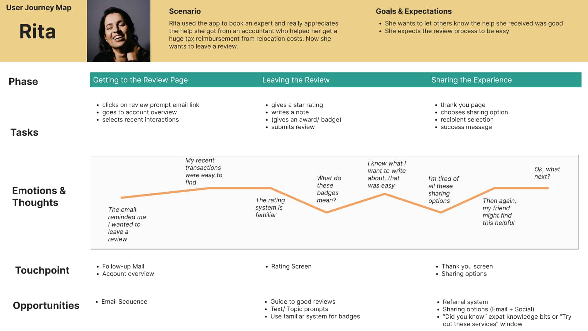
Rita is a professional. She’s busy and just doesn’t want to spend the time on looking for everything she needs. She isn’t super sociable, so she doesn’t have many friends she can ask for help, either.
User Journeys
I felt good about the personas. I would even hang out with Clark. They represent many issues that multiple interviewees had mentioned and should give distinct perspectives on any scenarios I come up.
Speaking of scenarios – as the next step I created User Journeys, based on the findings so far. The goal was to empathize with potential users and get more insight into what mental models they might have.
Also, it really helped me map out any potential trouble spots that might require special attention to find an elegant solution.
Ideate
“We must design for the way people behave,
not for how we would wish them to behave.”
― Donald A. Norman
Finding a solution
Initial Steps
So, what do users need?
The basic setup is a directory-style app, where users can search and browse for different experts they can contact.
Since lack of time and energy to “deal with everything” was an issue users had, I decided on incorporating an assistant service.
This is a premium service, that allows users to just have one person to talk to when they need something (and generates revenue for us). This assistant then would do the research on service providers and serve as an intermediary, on the user’s schedule.
Equipped with a decent understanding of the user base and the user journeys, I created some scenarios and mapped them out with User Flows.
After that, I got an idea of how to structure the app through Card Sorting tests with users, which would serve as the foundation for the sitemap.
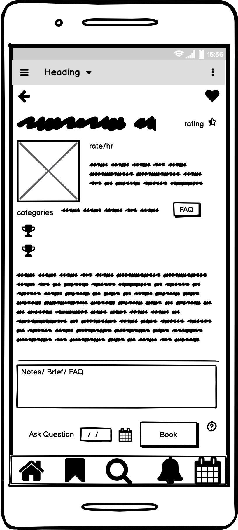
These Flows and sitemap were then used as a basis for some lo-fi mockups I created in Balsamiq and Adobe XD.
The process (and some peer feedback) was enough to figure out some kinks I had to iron out before refining the Design and creating a hi-fi prototype in Figma.
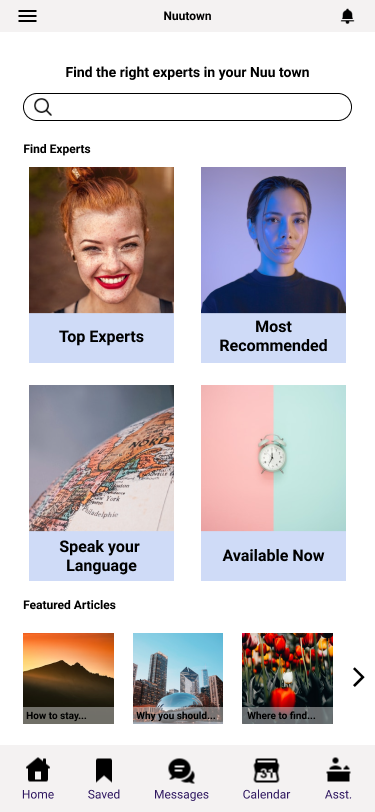
Low-Fidelity Mockup Example
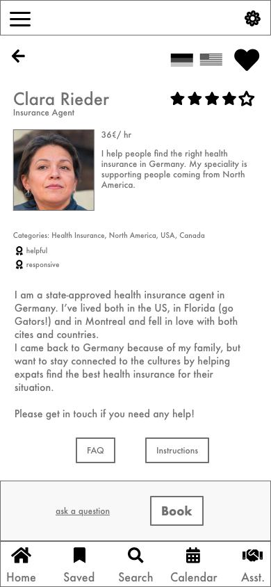
Mid-Fidelity Mockup Example
High-Fidelity Prototype
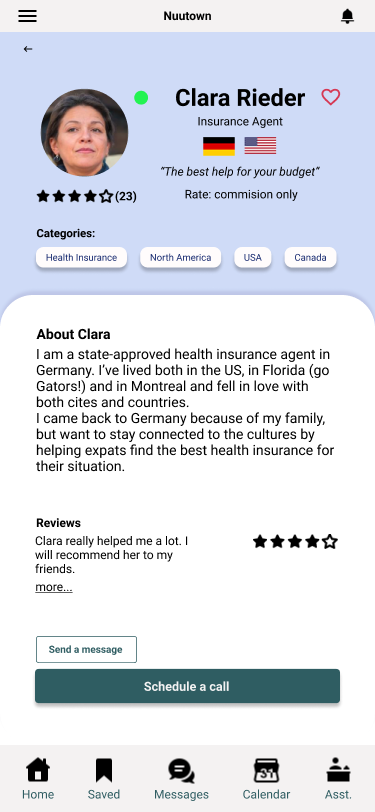
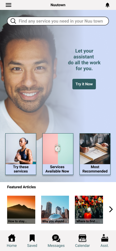
With the goal of user testing in mind, I tried to balance out effort put in before the tests, so I wouldn’t invest too much effort in wrong places and making it feel like a real app, so the users can be immersed and give me better feedback. Below are some example screens of the first version of the Hi-Fi prototype I created in Figma.
Example screens of the first iteration of the app for user testing (it gets better)
Test
Usability Testing
I carried out a total of 6 remote, moderated usability tests in which I asked participants to complete three scenario tasks.
The app was generally well-received and the assistant functionality especially stood out.
All particpants were able to carry out the test, however 2 users had trouble with one of the scenario tasks, so I adjusted the test script to account for that. The assistant function was popular once it was explained, but was cause for confusion without onboarding, so I added an onboarding screen for that feature after 2 tests.
Structuring the Findings
The findings were organized into the categories of oberservations, positive comments, negative comments and errors.
Since this was an exploratory testing session, I was happy to hear suggestions about any sort of functionality and not just focused on error discovery.
After I had the findings categorized, I created a rainbow spreadsheet for a better overview and clarity on which feedback was given multiple times.
It also gave me the opportunity to quickly come up with some ideas for improving on the design.
For a detailed look at my findings and the improvements I made based on them, you can refer to the Usability Test Report
Iterate
UX Refinements
In regards to my initial prototype, I worked much on clarifying and simplifying the user flows. At first I tried to make everything available, but realized it confused users and a more streamlined approach is better. With the findings from the tests, I could more easily cater to the users’ wishes. Below are some examples of usability improvements.
Evolution of the Home Screen
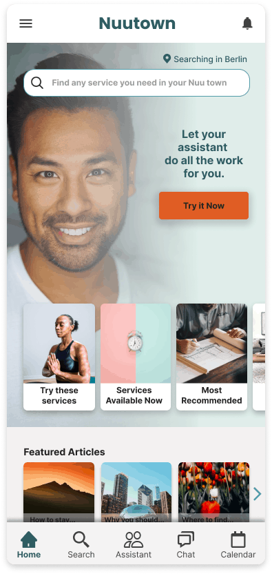
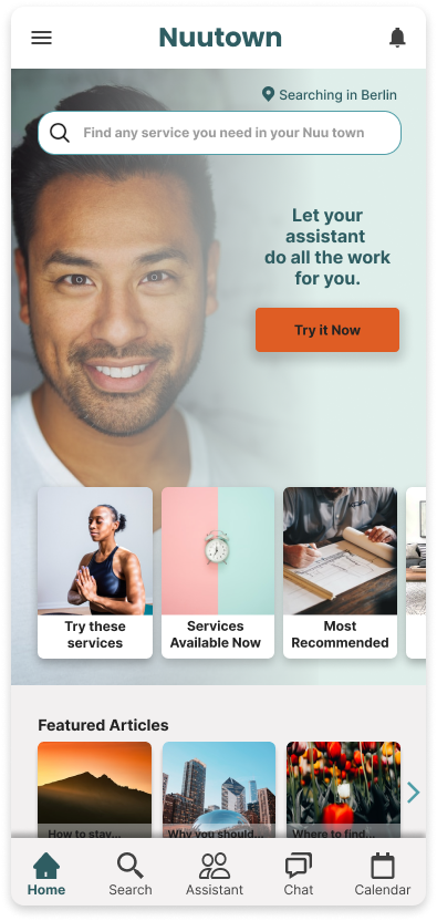
The Home Screen, as the introduction to the app, was something that went through multiple iterations based on my preferences, discussions with industry experts and through a preference test with users.
What mainly guided me here was simplicity and guiding users to what helps them. An interviewee said “I don’t know what I don’t know”, so that is reflected in the category suggestions.
The primary CTA leads to the assistant, a feature users loved (and would happily pay for).
Evolution of the Search Results
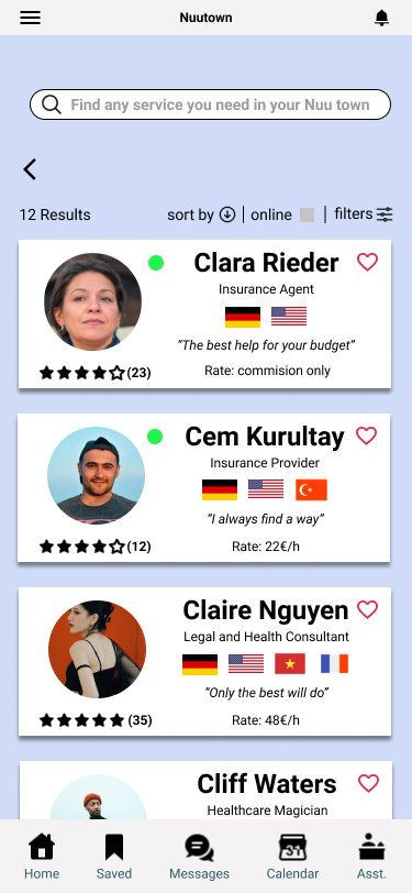
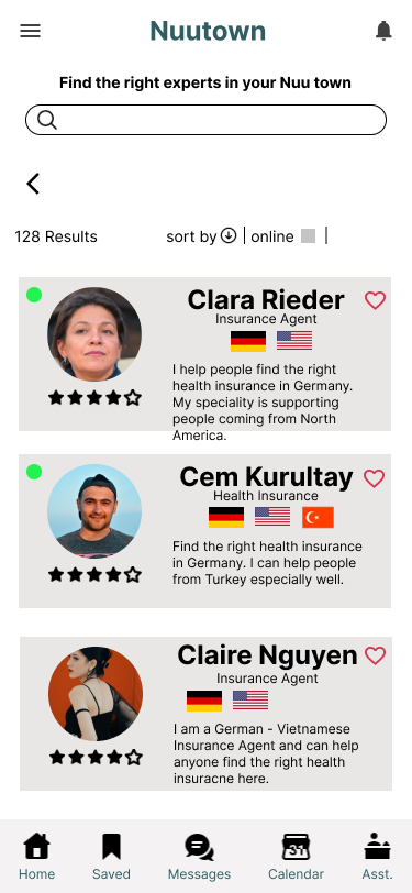
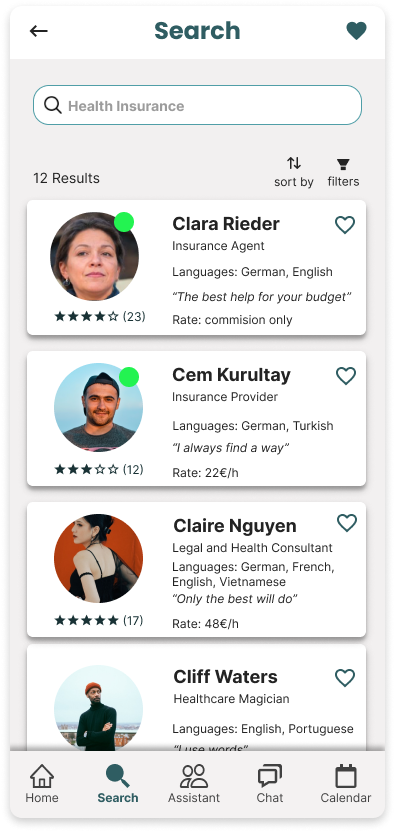
The Search Results page was a bit complicated for me because I wanted to make it pretty, but ended up overdoing it with the colors. So I simplified, adjusted the cards to contain information that was often requested during testing (rate, an intro (through a tagline), and languages spoken shown not as flags, but spelled out).
The “online now” badge was cause for confusion with a floating green dot, so I modeled other popular apps with the badge styling.
Core functionality – the Assistant
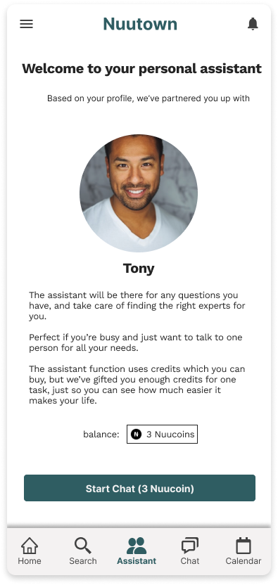
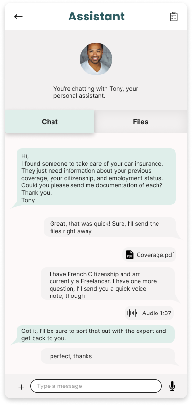
The Assistant function was really popular and users loved it… once they found out it exists and understood what’s going on.
That’s why I placed the assistant prominently on the Home Screen (again, conversions) and created a simple onboarding screen, explaining how it works.
For now, the user pays with an in-app currency, but it wasn’t a hit during testing, so that’s sth I’d look into again.
As for using the Assistant – it’s a chat interface. Simple, elegant, practical. Users are familiar with it and it serves as a repository for any files transmitted, which are easily accessed through the tab bar.
Curious about witnessing the app in all its glory? I can understand that, so please have a look at the Nuutown prototype
Further Steps
Where do we go from here?
Meet the Assistant
Next Steps
I think that the assistant is a standout feature and I think that if that is cleverly solved from both the user side and the backend, it would make for a good business case.
If we can get more people to try the assistant I am sure we will have a high rate of returning customers.
This would have to be verified by looking at the number of assistant tasks booked.
It would be interesting to test the features and do more research on expected functionality, but also become clear of the optimal price point and if a subscription model or IAP-model makes more sense.
To explore this, I would conduct a series of interviews again, trying to focus especially on users who are happy to pay for convenience.
The UI could use more polish, and I think it would be important to work out how the suggestion categories work.
I also think for the first launch phase it would make sense to focus on one category (housing, finances etc.) for a more targeted marketing approach. This would allow for a realistic scope of the product and promises to users that are easier to uphold.
More research could be conducted about the biggest painpoints for expats moving abroad and choosing a category based on that.
Another important topic to adress is privacy and security – users are sending private documents with sensitive date, so we have to put users at ease, and also make sure we are handling the data responsibly.
One other aspect that came up frequently during discover was community – so a good networking/ recommendation system could be something that adds a lot of value.
Takeaways
Some Closing Thoughts
I had built various products before for my own projects, but I rarely used direct interviews to learn more about the problem. I’d go off of user sentiment I found on message boards, Quora, user reviews etc., but nothing has given me better insight into users’ worries than actually talking to some of them.
It’s not about them providing a solution (that’s where I see the designer’s role), but them sharing what they actually do with or need from a product. There are strange things going on in the world – Some people use scissors to cut their pizza… what’s going on? (But should we accomodate that?). As quoted above “We must design for the way people behave, not for how we would wish them to behave.”
I found that I really enjoy working on designing the “how it works” rather than “how it looks” and creating high-level functionality from user research (which I also took pleasure in), rather than fleshing out details. I am well aware that something that looks nice is generally more likeable, so I don’t disregard it, but I’m just saying I’d make a great partner for someone detail-oriented and visually gifted, but who doesn’t quite get the big picture.
